CapTech Consulting
Art Direction | Typesetting & Layout | Visual Brand Identity | Motion Graphics
My role as a Senior Marketing Designer at CapTech encompassed a wide array of responsibilities, from strategic input to hands-on design execution. This role was instrumental in driving the success of the brand refresh initiative and ensuring that CapTech's visual communication was not only consistent but also compelling and aligned with the company's strategic goals. This project played a significant role in enhancing CapTech's brand presence and market positioning.
Art Direction
I worked closely with the rebrand team and marketing team members to ensure that the new brand guidelines were accurately interpreted and consistently applied across all design materials. I maintained a cohesive look and feel that resonated with the brand's core values and messaging. The objective of the rebranding initiative was to achieve a refined and professional image, create a dynamic and dimensional visual identity, and project an image of expansiveness and progressiveness.

Typesetting
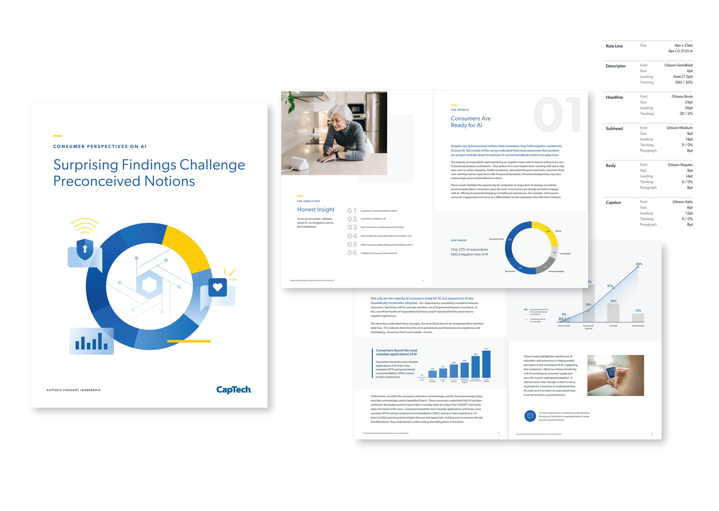
Gibson is a robust, humanistic sans-serif typeface that seamlessly integrates into a variety of design layouts. Leveraging its lighter weights enhances the overall aesthetics and fosters a heightened sense of professionalism. By instituting comprehensive typesetting standards, I could easily apply across all marketing collateral, we guarantee the maintenance of brand consistency.

Alignment & Layout
By implementing techniques such as offsetting alignment and layering elements like text and images, we can introduce a dynamic sense of movement and depth within the design. The judicious application of white space is equally imperative, as it contributes significantly to the overall aesthetic. Strategically overlapping images to show depth while ensuring text remains unobstructed for readability is a key consideration. Additionally, the incorporation of gray boxes serves to enhance the three-dimensional quality of the visual elements.

Visual Brand Identity
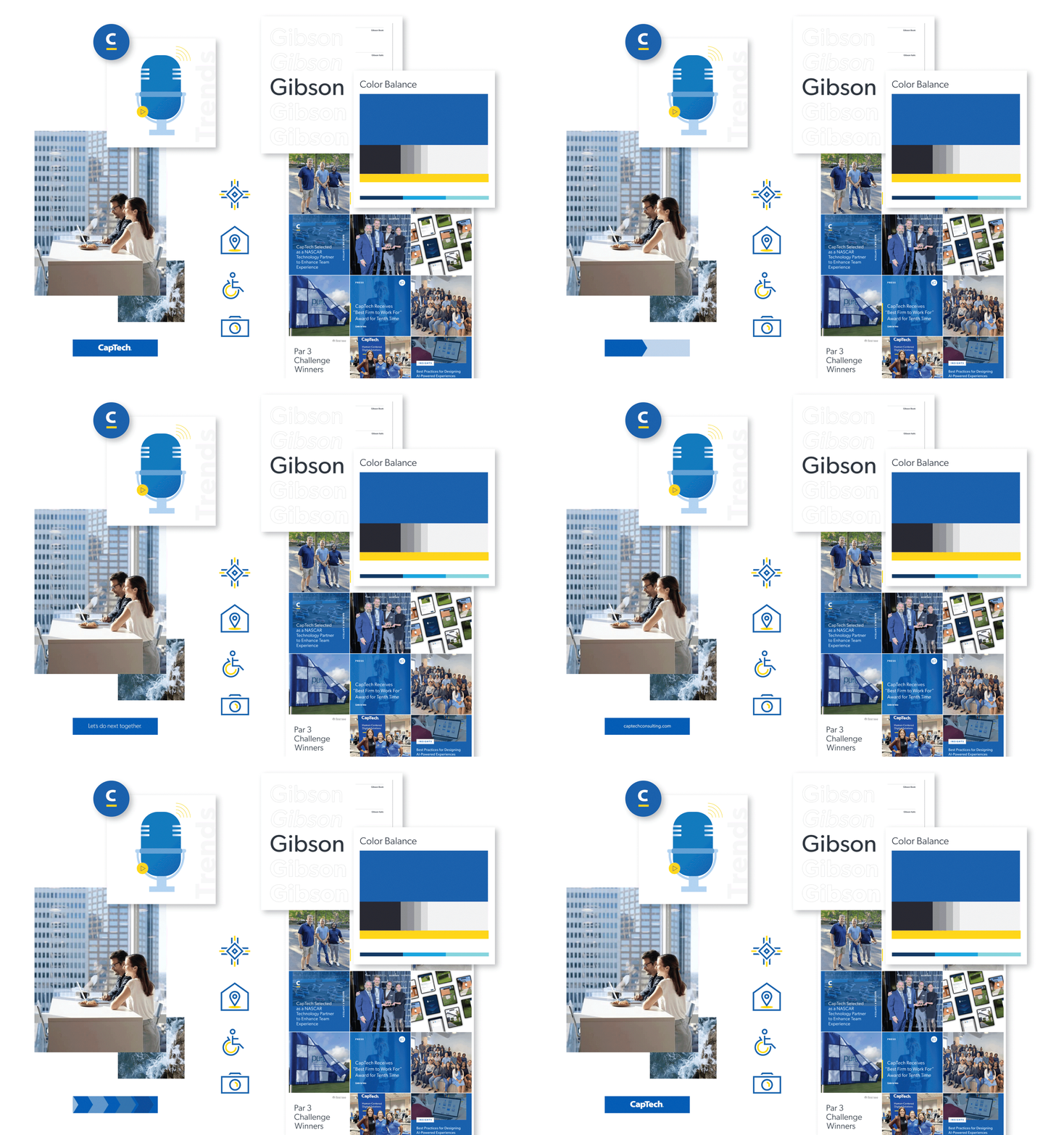
I created and curated design elements such as illustrations, iconography, and animations. With the rebrand team, we developed mono-line icons with a simple and professional style, maintaining consistency in line weight, radii, and negative space, allowing them to be used individually or in groups. By employing layers to the illustrations, we were able to introduce movement and depth, while distinguishing the style from iconography through the use of blues in the brand's color palette.

Digital Brand Identity
I ensured visual consistency across all marketing materials online. I developed new branding assets for CapTech's digital presence, including internal marketing SharePoint site identity, email banners, signatures, and LinkedIn banners. Working with digital marketers, we were able to translate PDF articles into digital formats.

